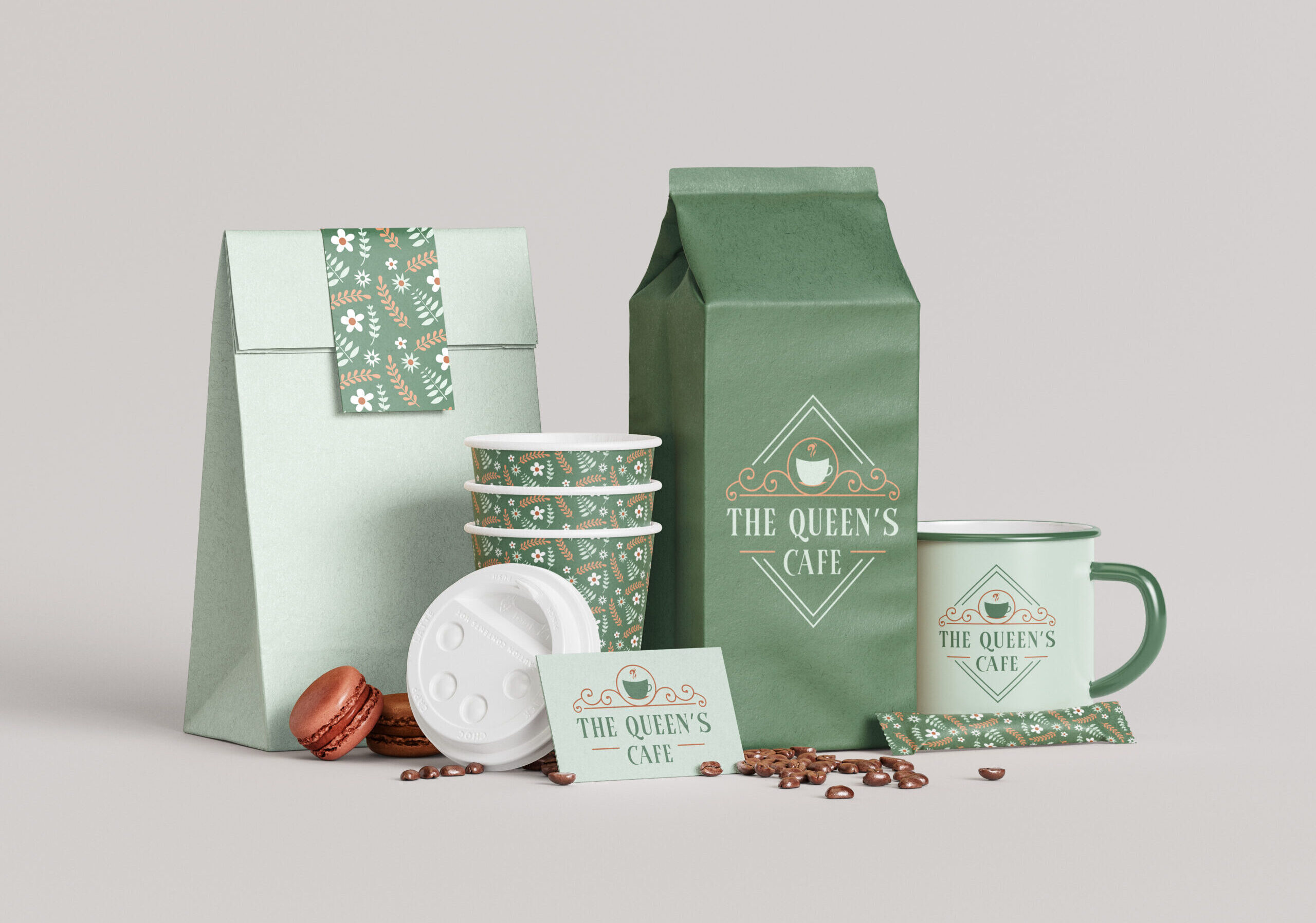
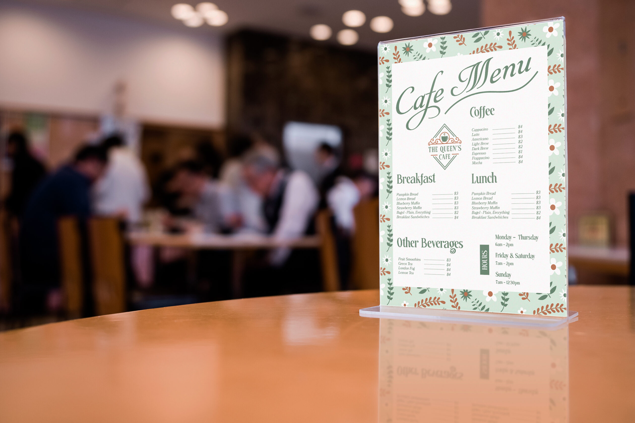
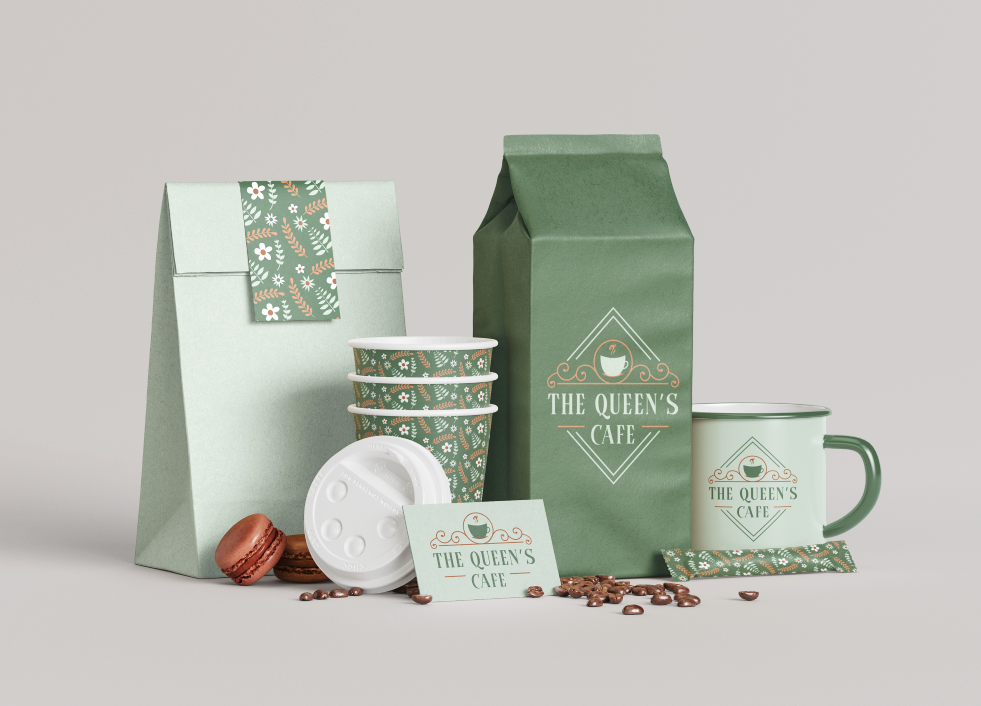
About the Project: The Queen’s Cafe branding, packaging and menu are designed in the style of the Victorian Era. The design echos the floral and earthy tones of the cafe environment. The cafe serves breakfast and lunch every day of the week.
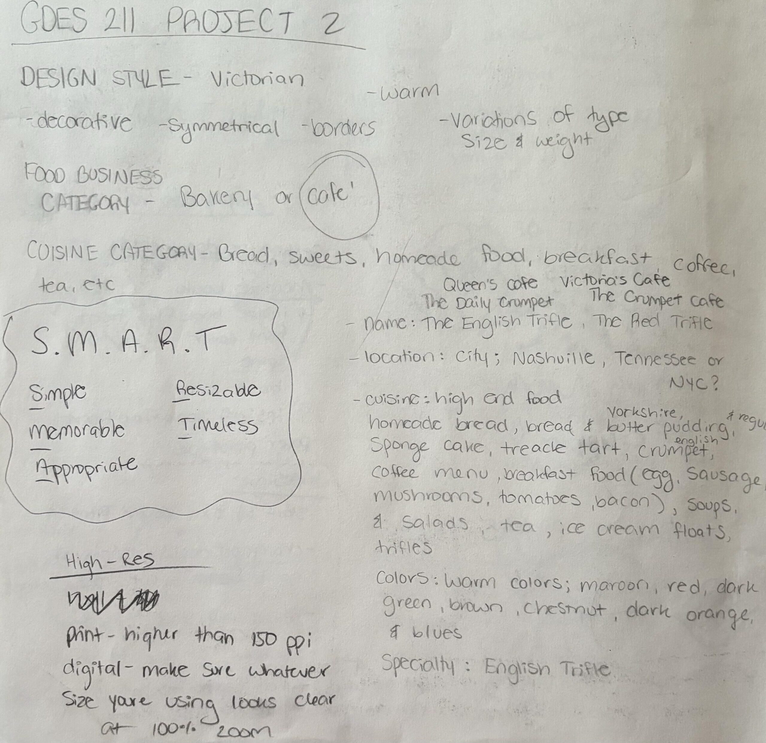
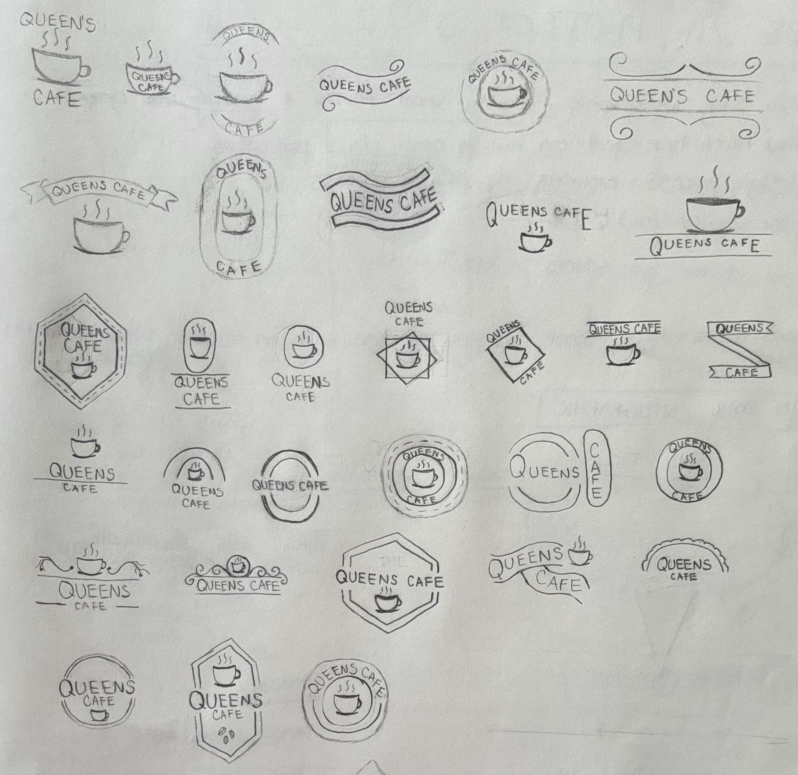
Research: For this project, I chose the Victorian Era of graphic design to be the inspiration for a new cafe concept. The Queen’s Cafe features a brand inspired by the intricate line work and bold typography of this time period. In the first stages of the project, I started with doing a deep dive into the history of the Victorian Era and took note of the design elements that are prevalent in that style. I discovered that the style is very decorative, intricate and symmetrical. With this initial research, I began sketching potential logo solutions including different symbols, geometry and typography applications.
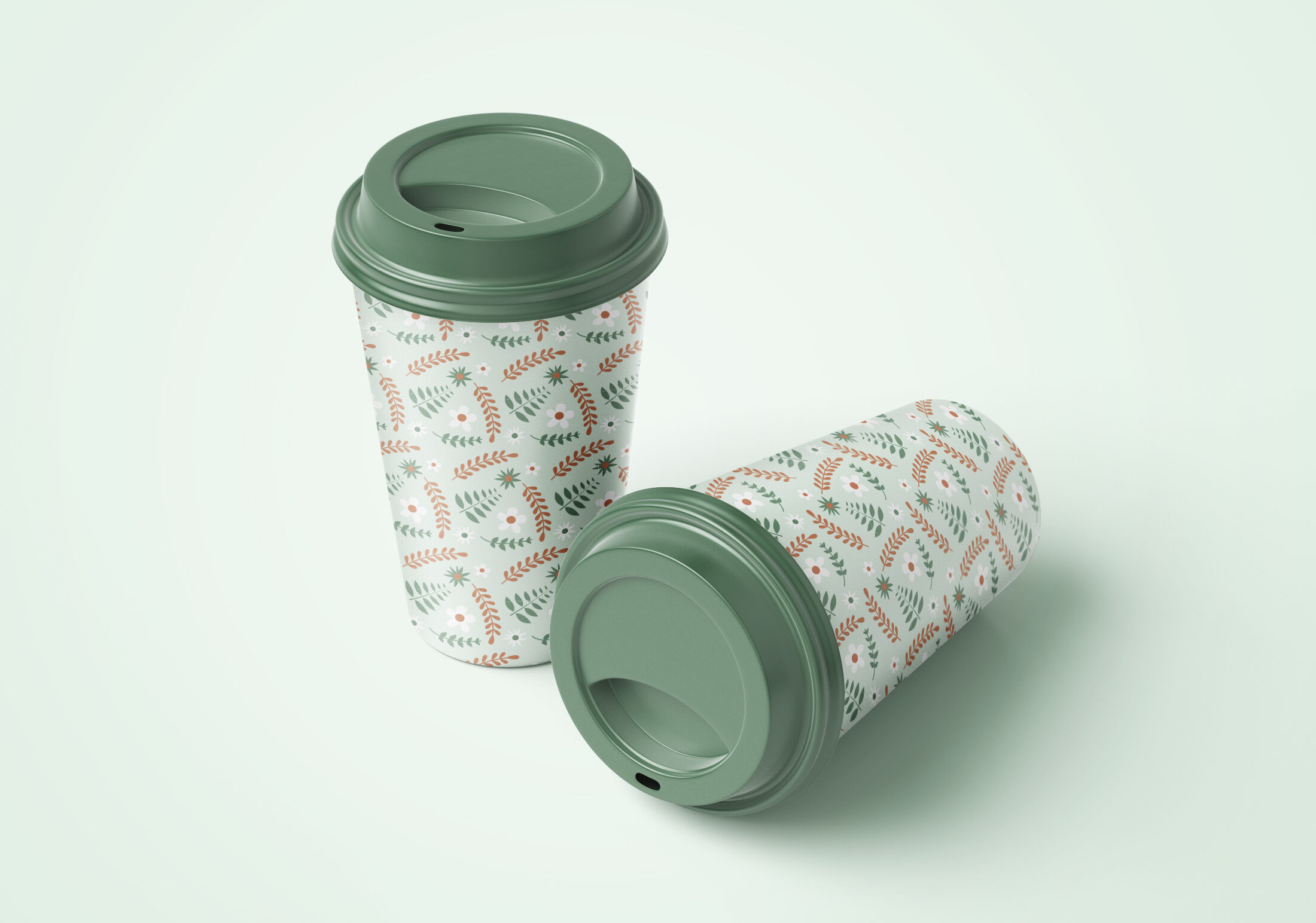
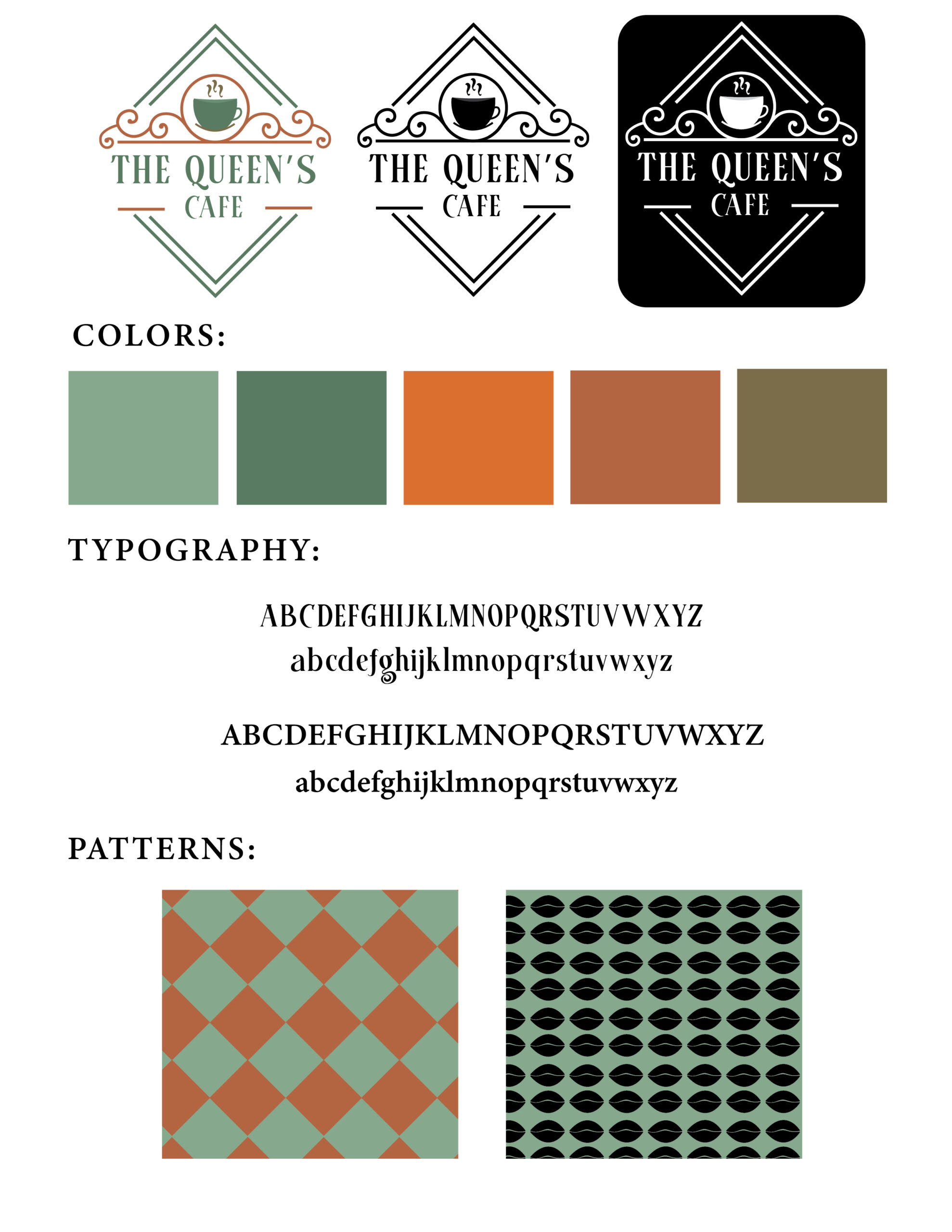
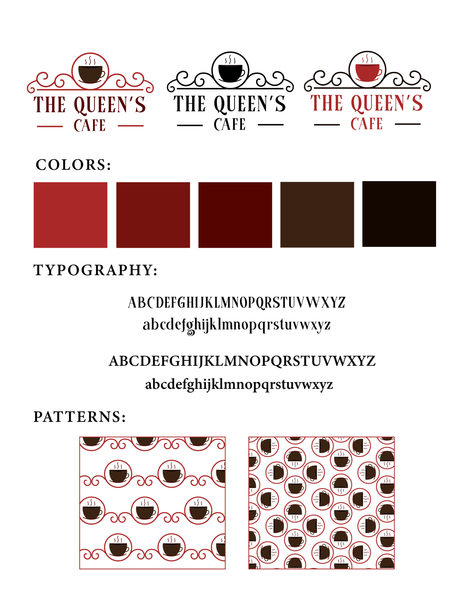
Drafts: I then moved into the digital space and went through multiple versions of logos, color combinations and patterns. I started with a warm color theme and focused on the symbolism of coffee cups mixed with intricate line work and circles. After feedback and deliberation, I switched to a theme of greens and browns and expanded upon the logo.
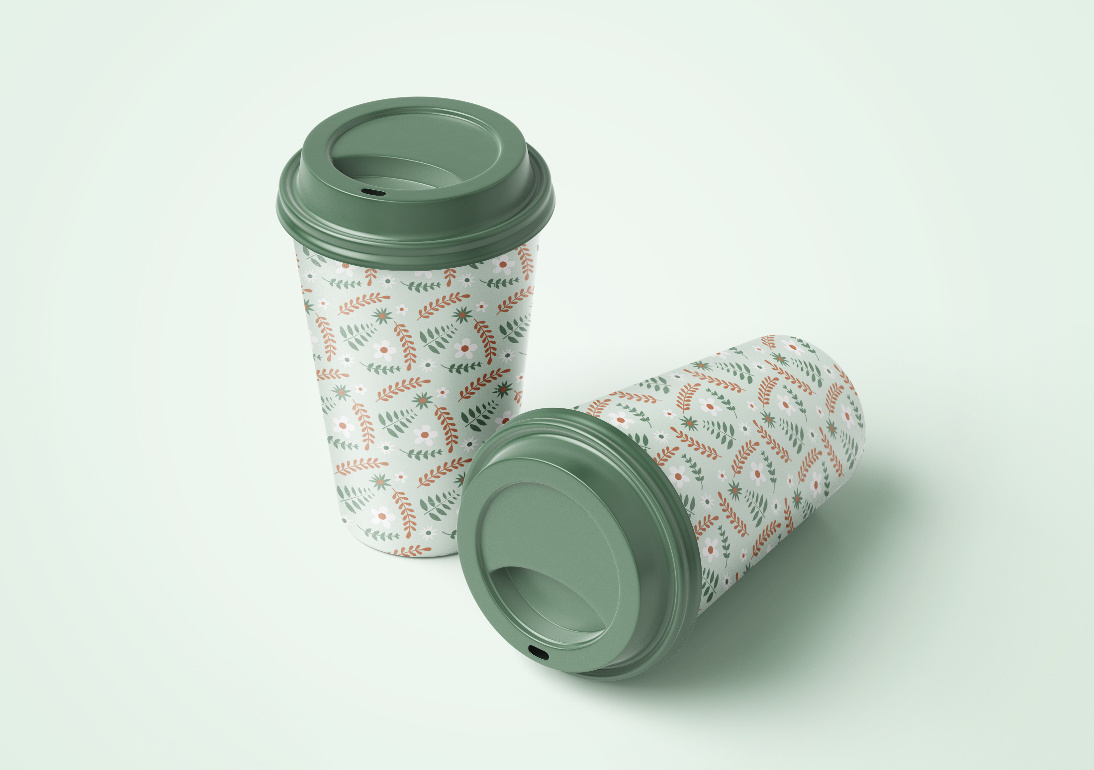
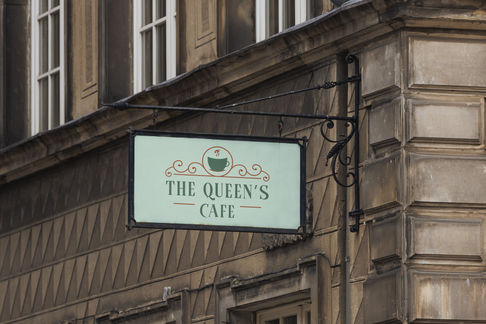
Deliverables: My final solution for the brand identity maintains the green and brown color palette and symmetrical lines. Additionally, I created a secondary logo and typographic logo as well as a floral pattern. My final deliverables are three logos in two different color schemes, a full brand guidelines, a cafe menu, and mockups of cafe packaging and environmental graphics.