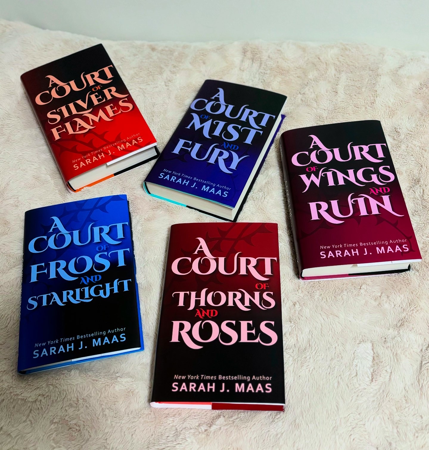
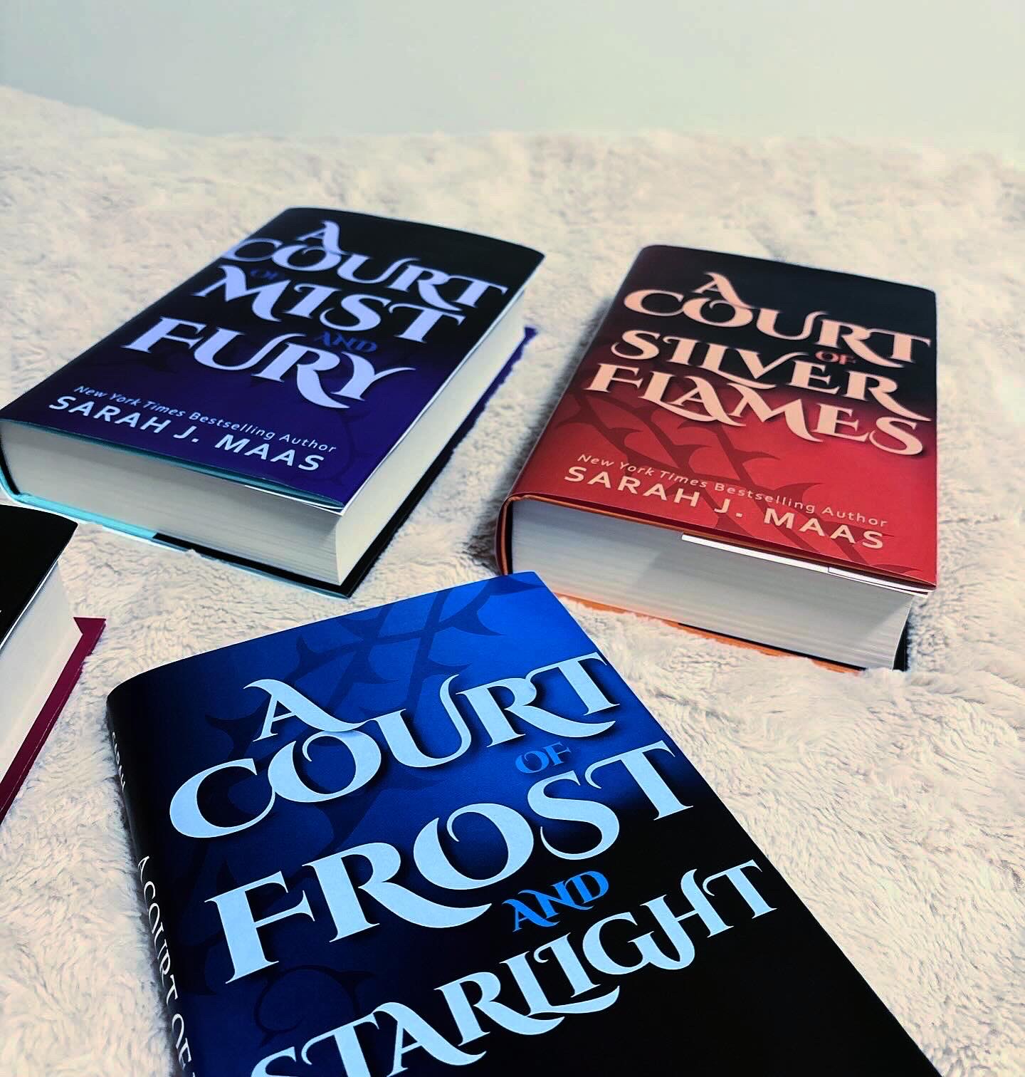
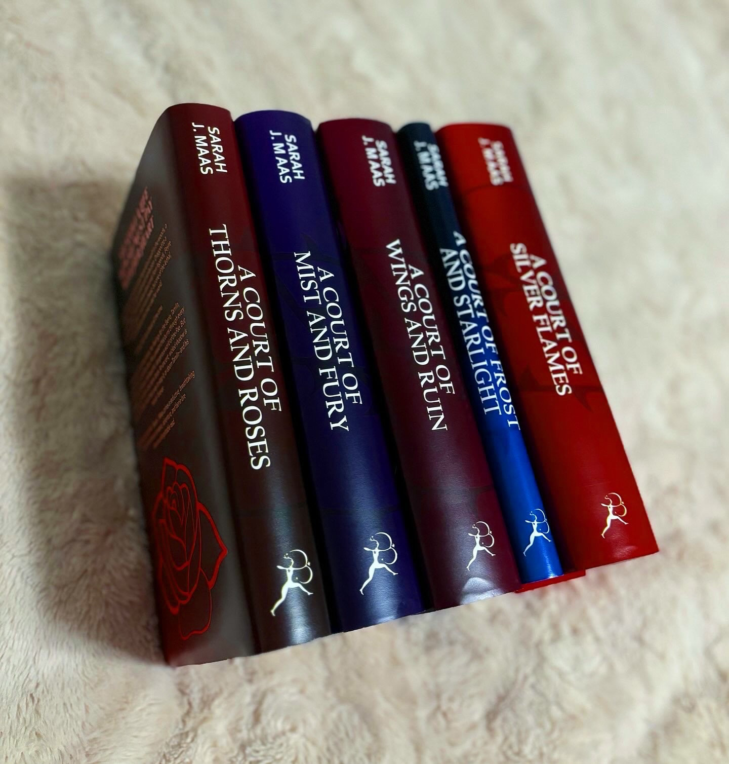
About the Project: A Court of Thorns and Roses is an ongoing fantasy & romance series written by Sarah J Maas. For this project, I redesigned all five released books in the series. I focused on emphasizing the magical elements of the series through color, typography and illustrations.
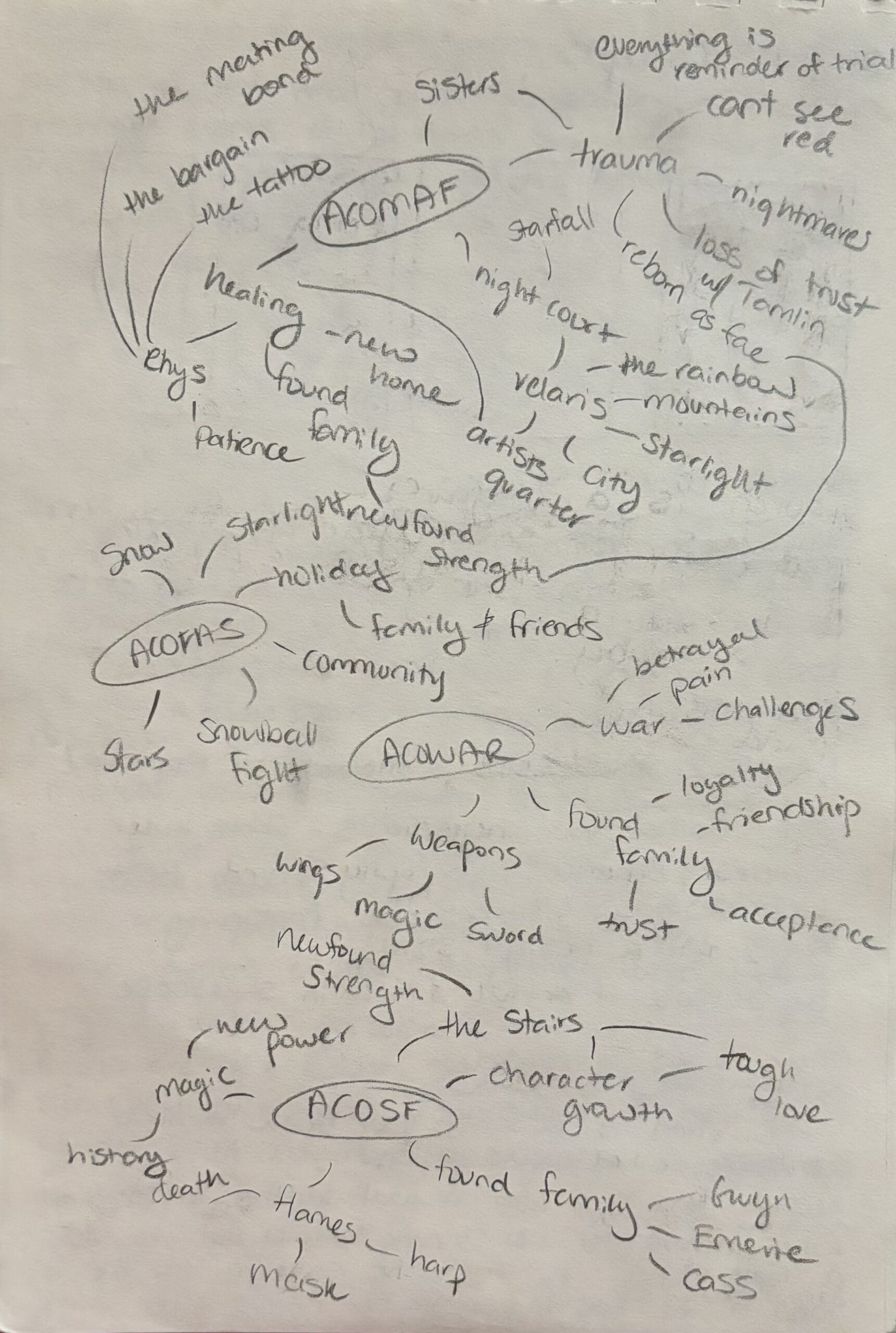
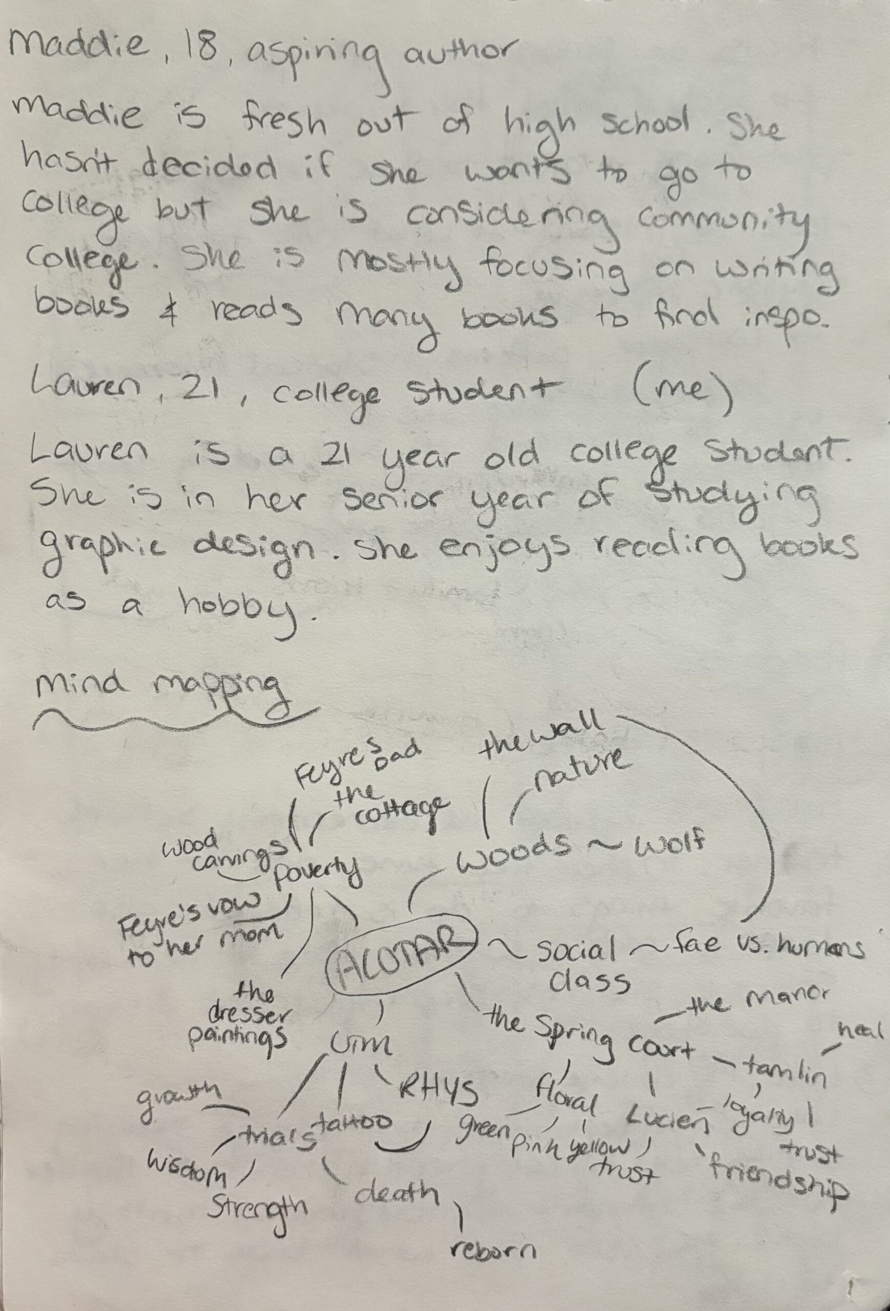
Research: My process for this project started with visual research about the book series and similar book series and the why certain design choices are made on book covers. I also complied a mood board with images that were inspiring the style I wanted to design the books in. These mood boards included bright colors on black backgrounds. I then moved into written research. This research included writing down keywords and symbolism from each book, creating personas of my audience, sketching potential visual ideas and mind mapping keywords.
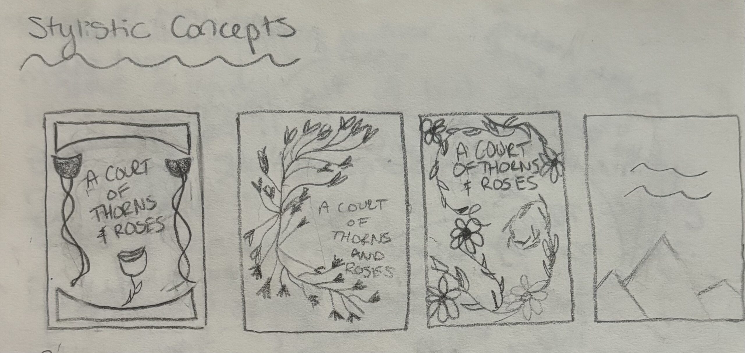
Drafts: I went through many versions of the book covers. Each draft took a different approach to the design brief. Despite creating mood boards inspiring the direction I wanted to take the project; I strayed pretty far away from the mood board for most of my process but eventually came back to it at the end. My process started out very geometric, with a heavy focus on only one symbol, mountains. It then evolved into variations of thorns and vines. As I moved through each of these versions, I received feedback from my colleagues and professors. Once I got to the last version shown, which focused heavily on stars and one color, I hit a bit of a creative block and took a step back to reevaluate my vision. That is how I ended up circling back to my original mood board concepts, which led to my final version.
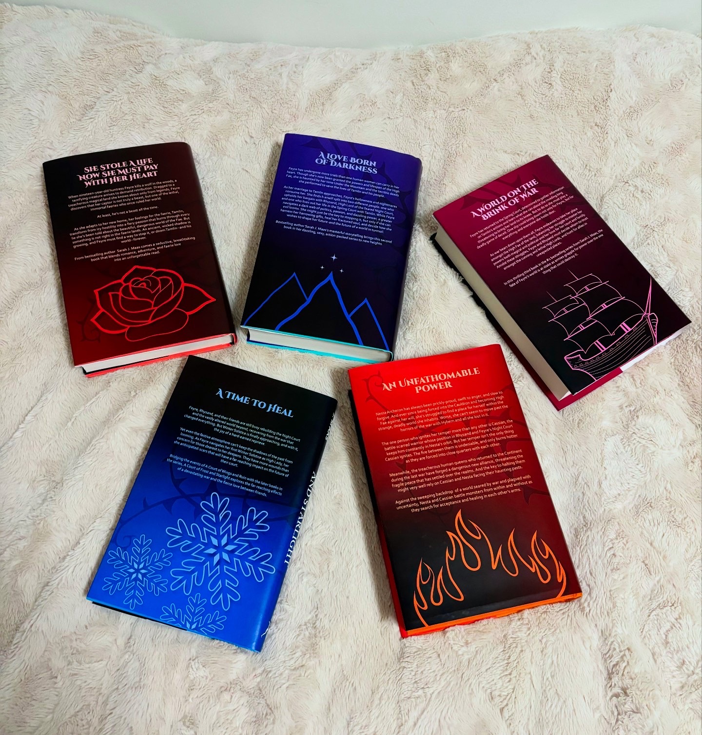
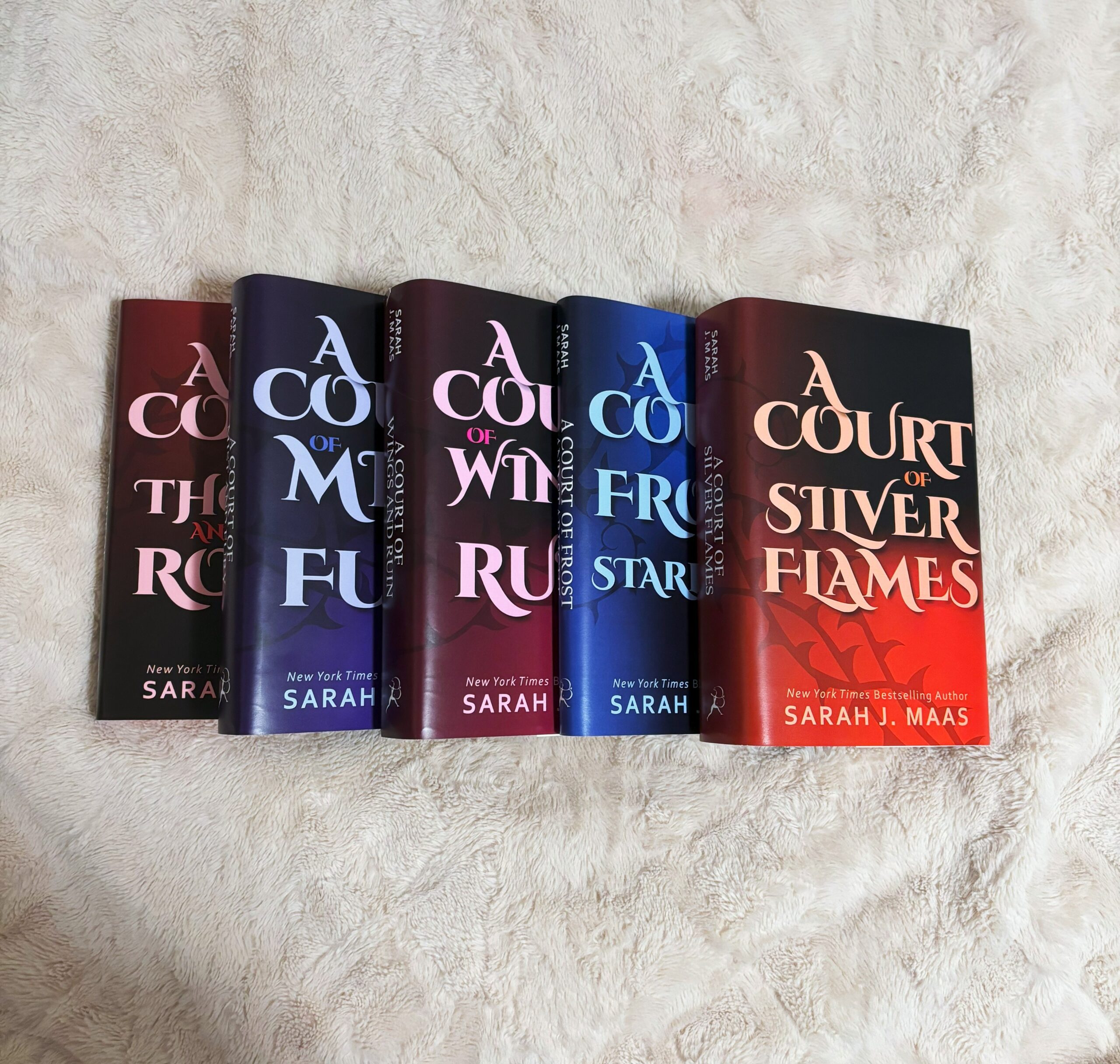
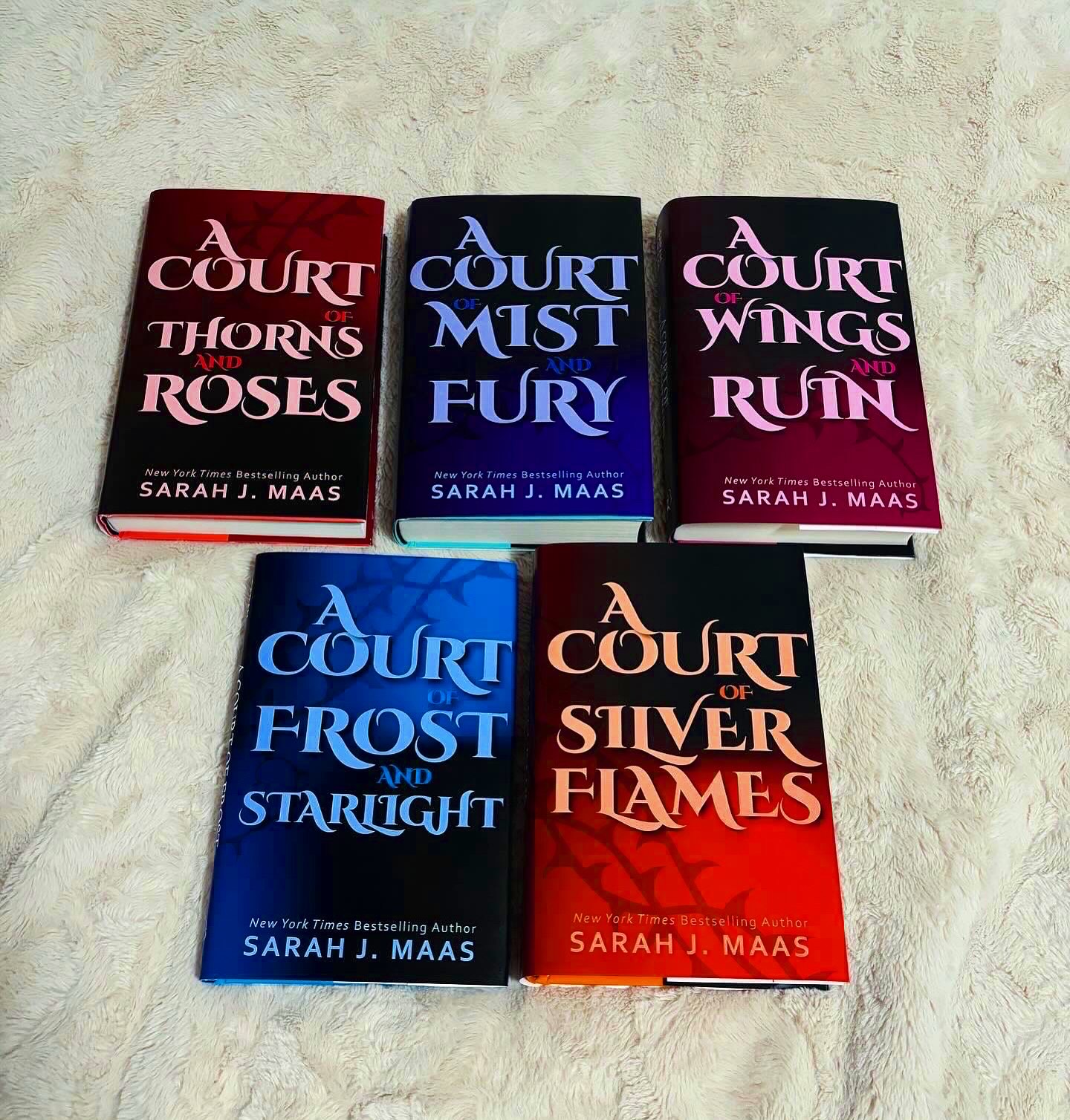
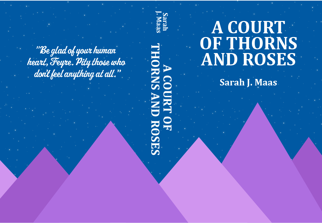
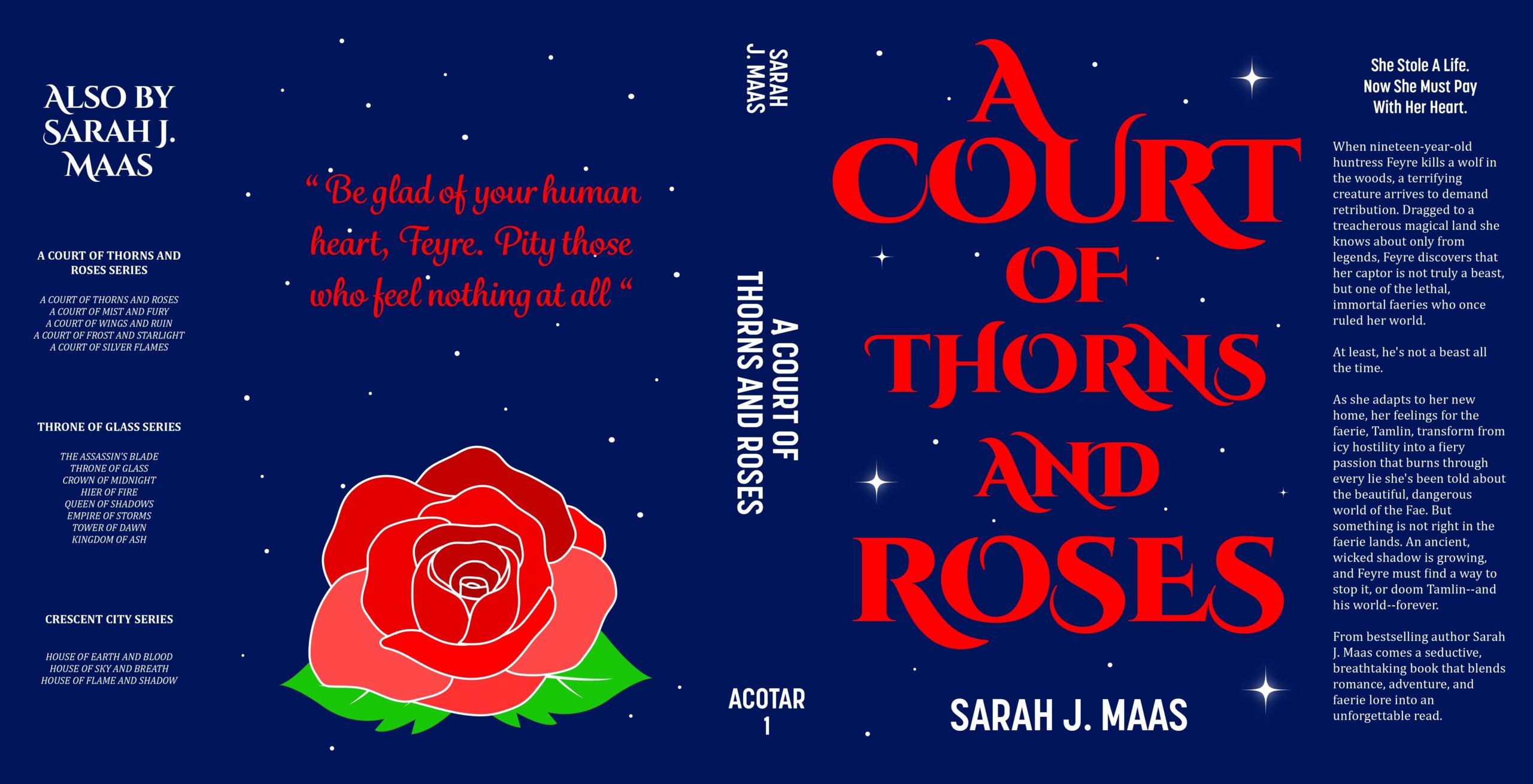
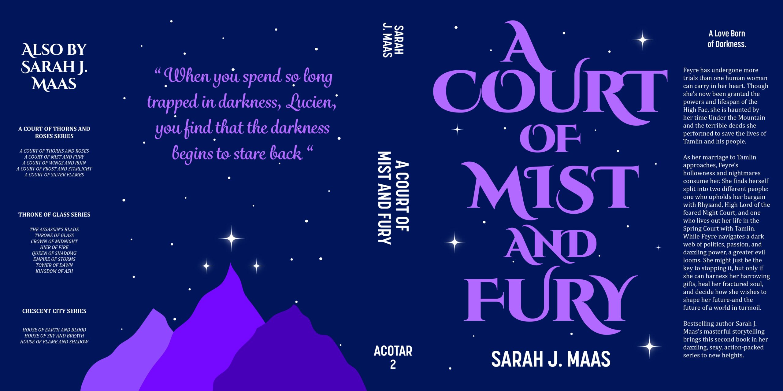
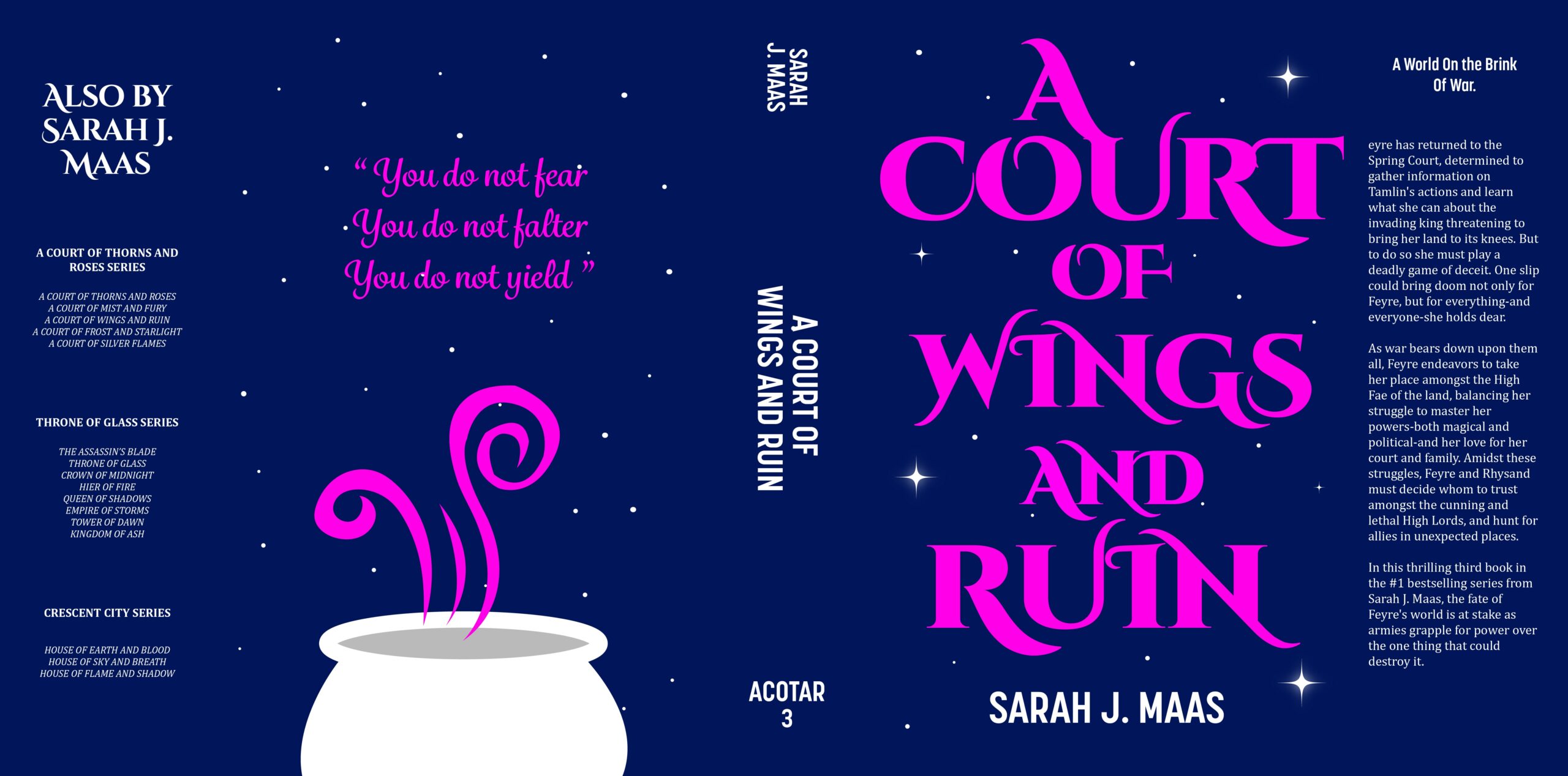
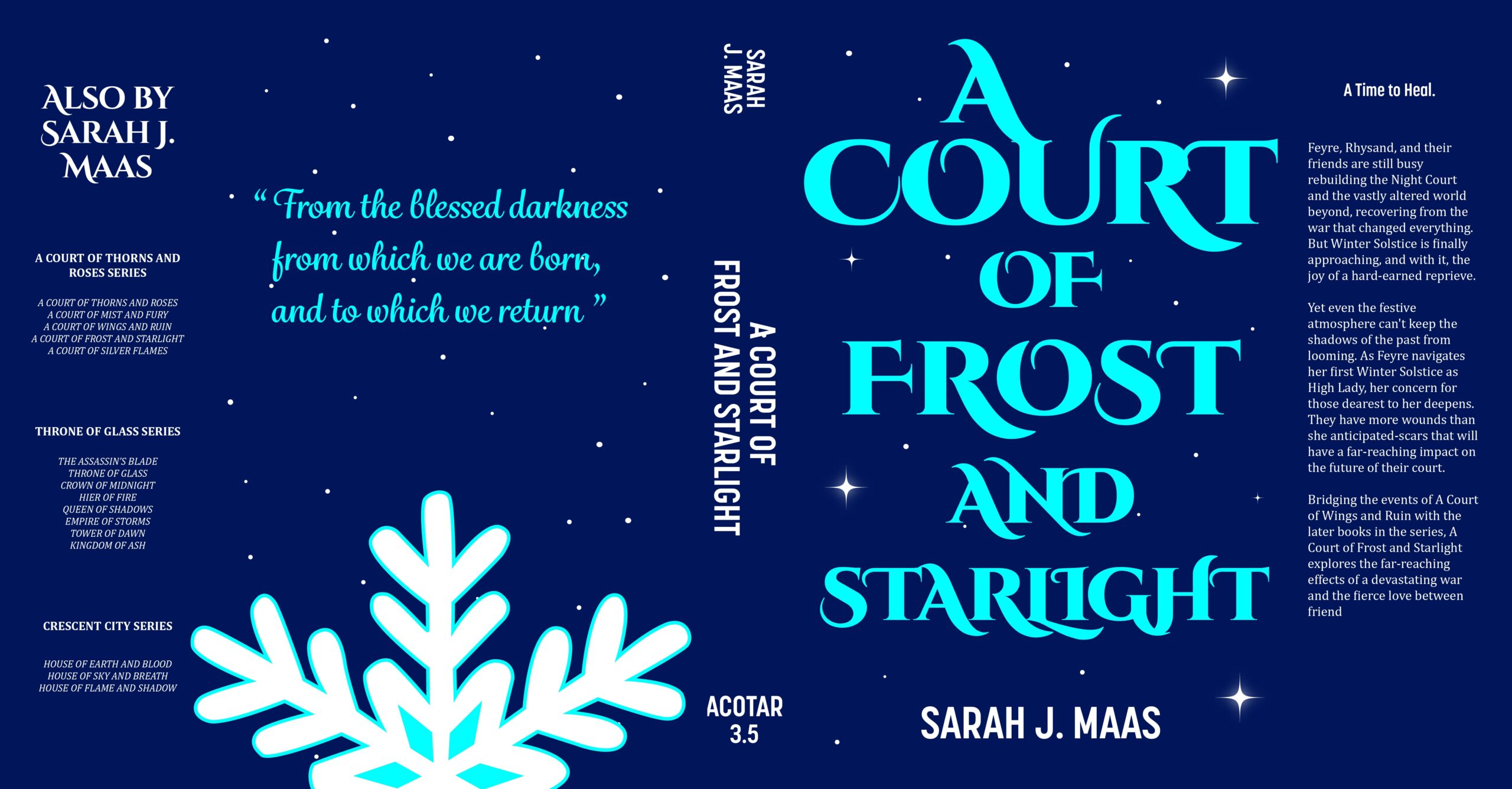
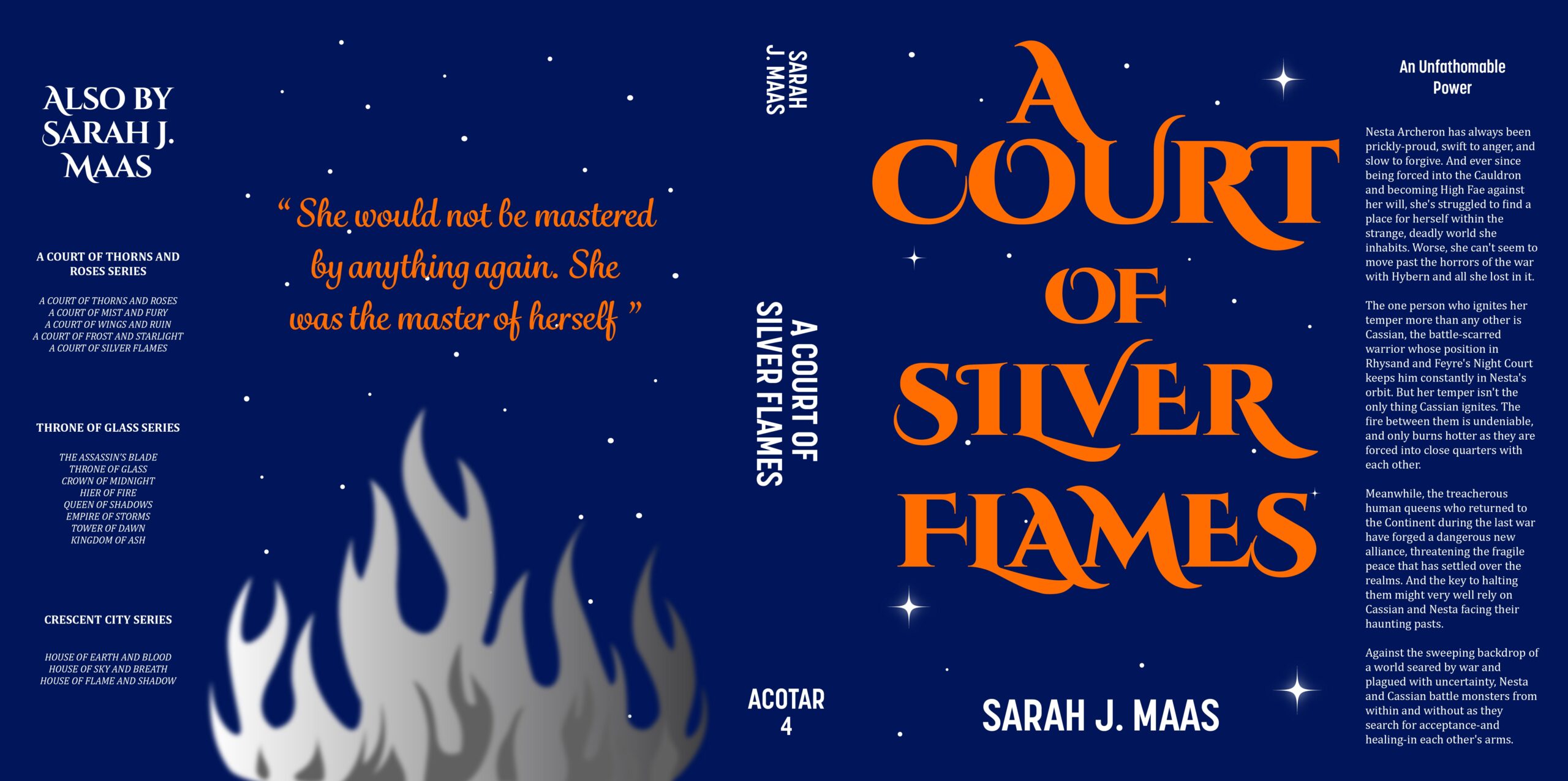
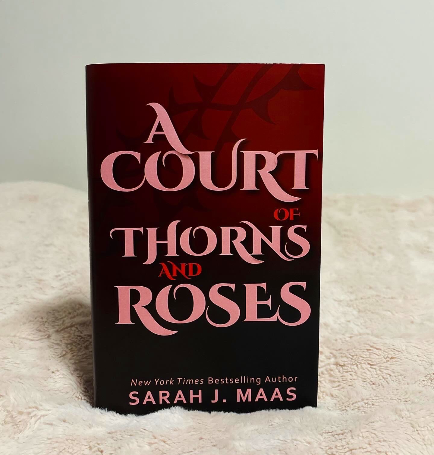
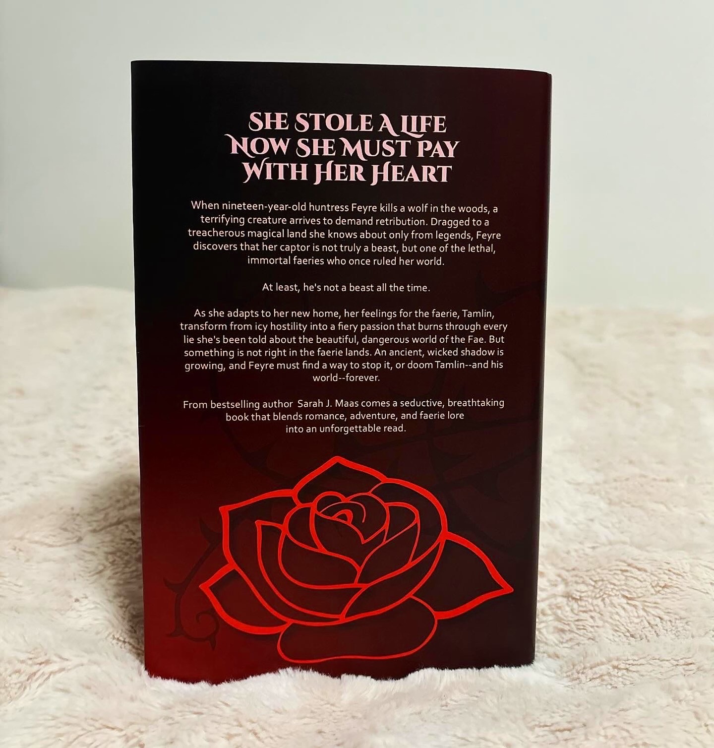
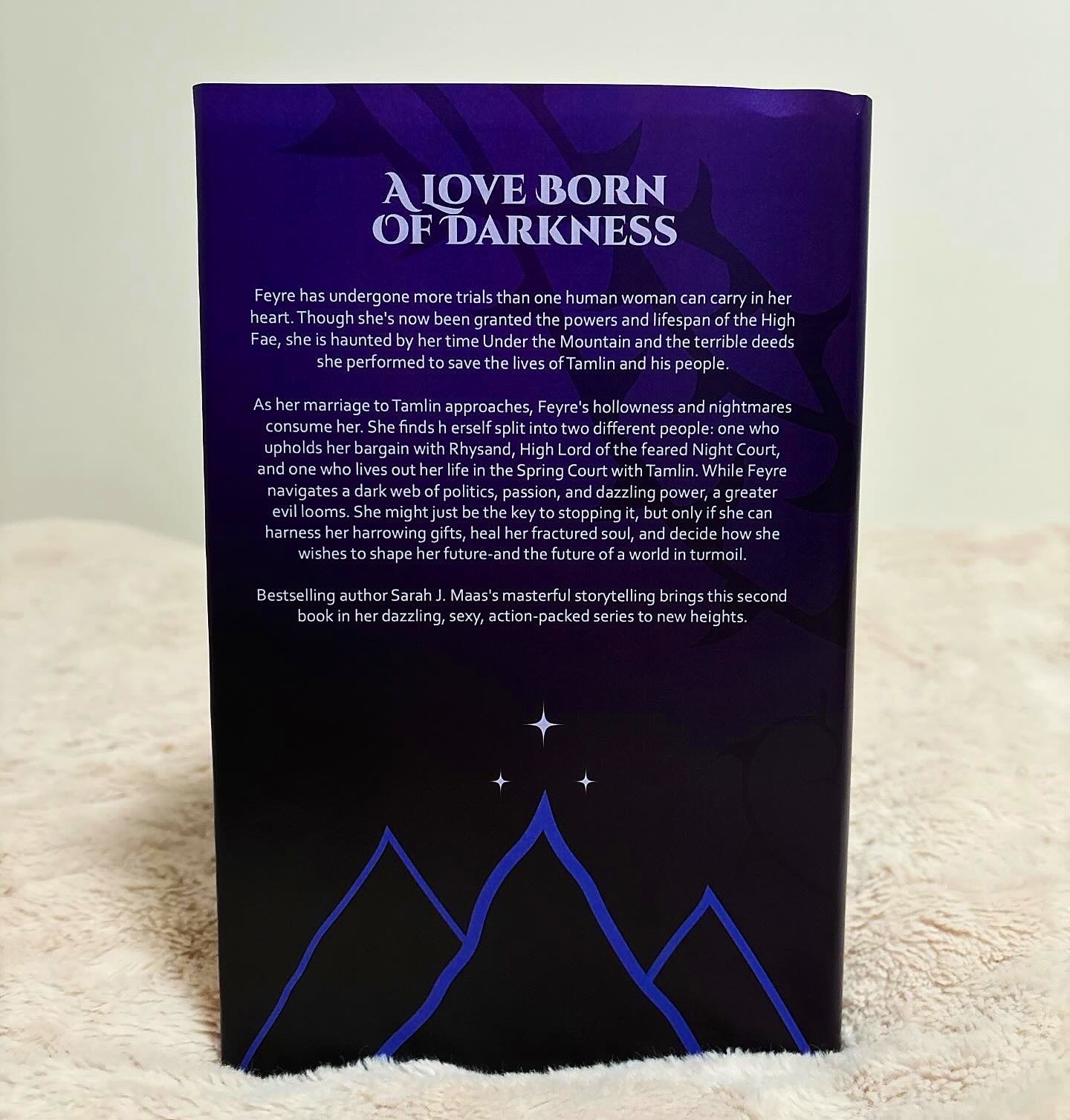
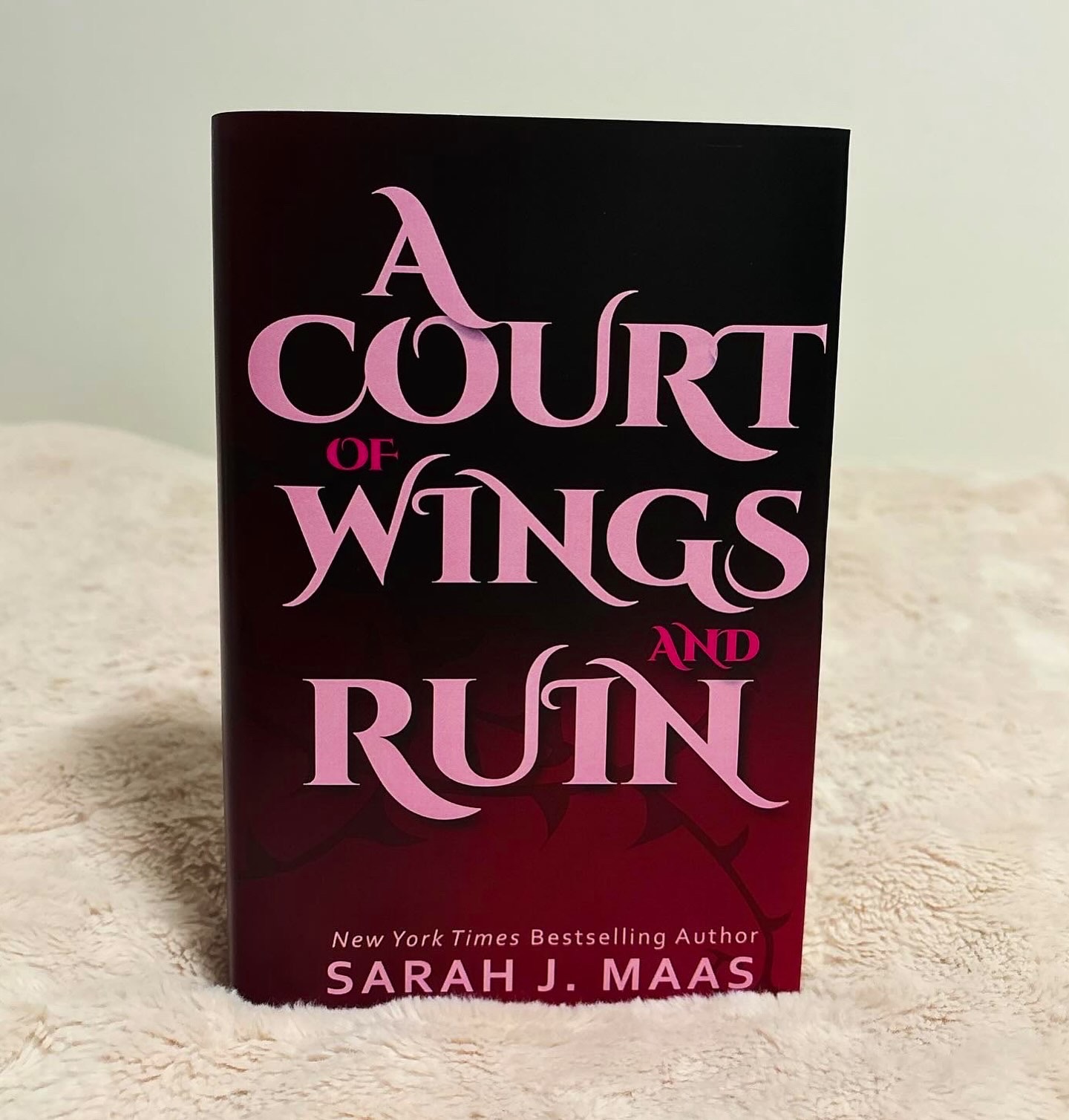
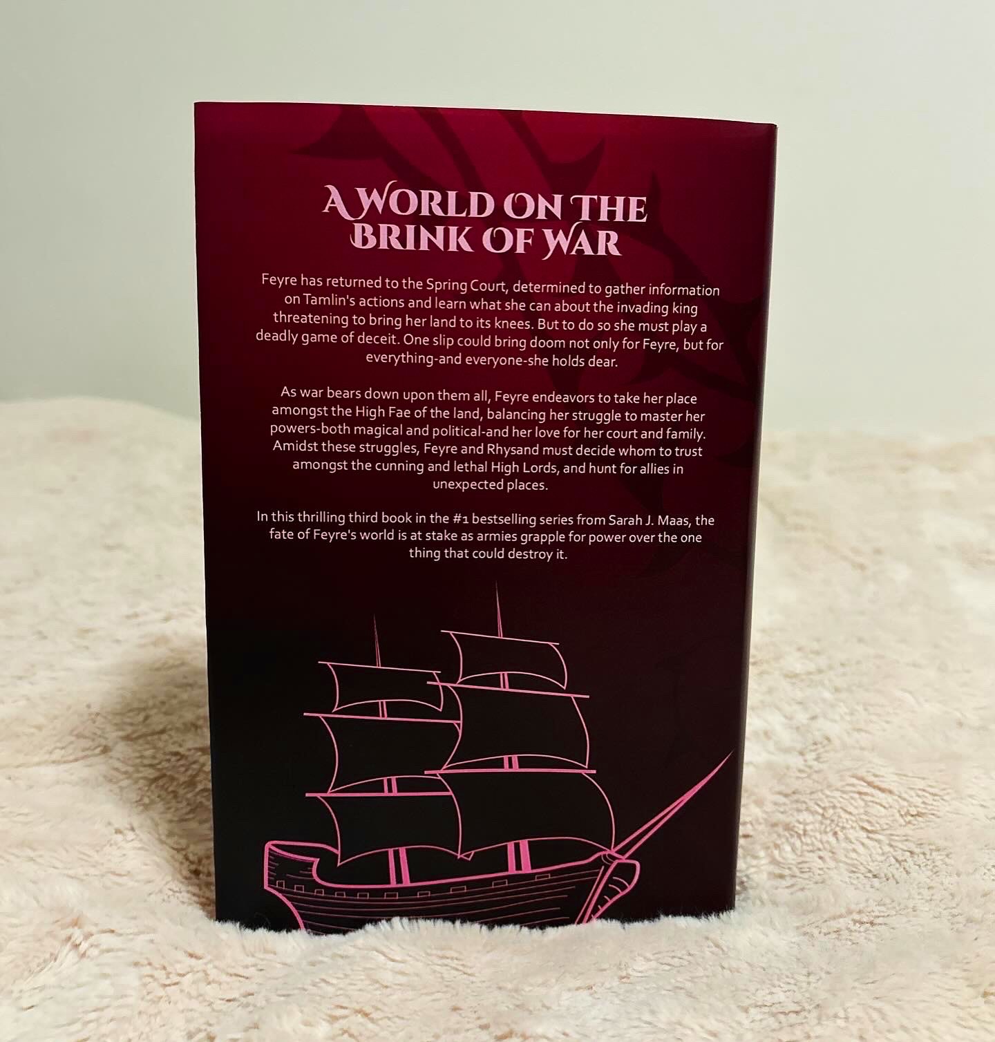
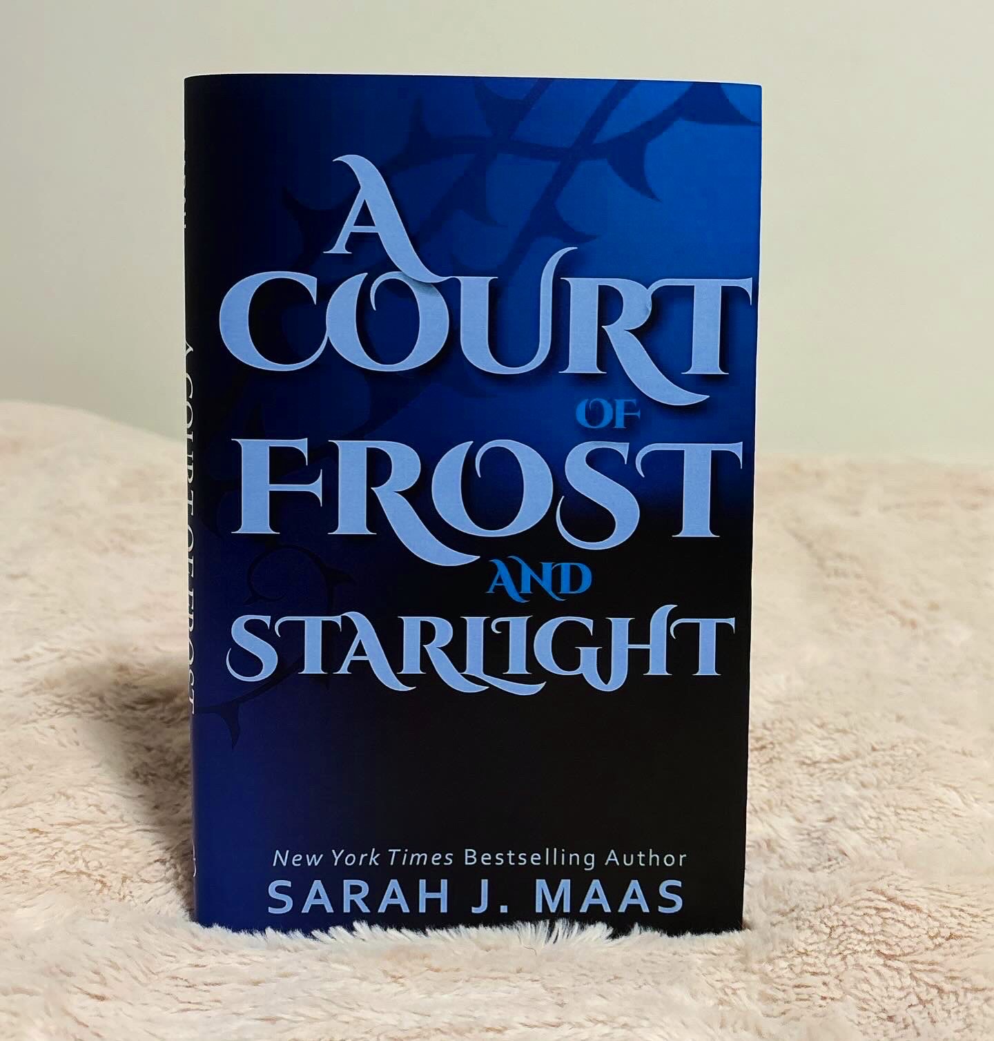
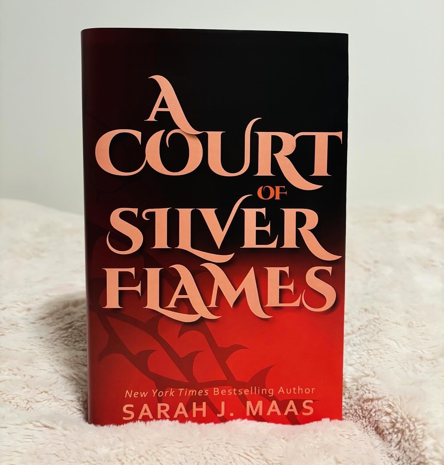
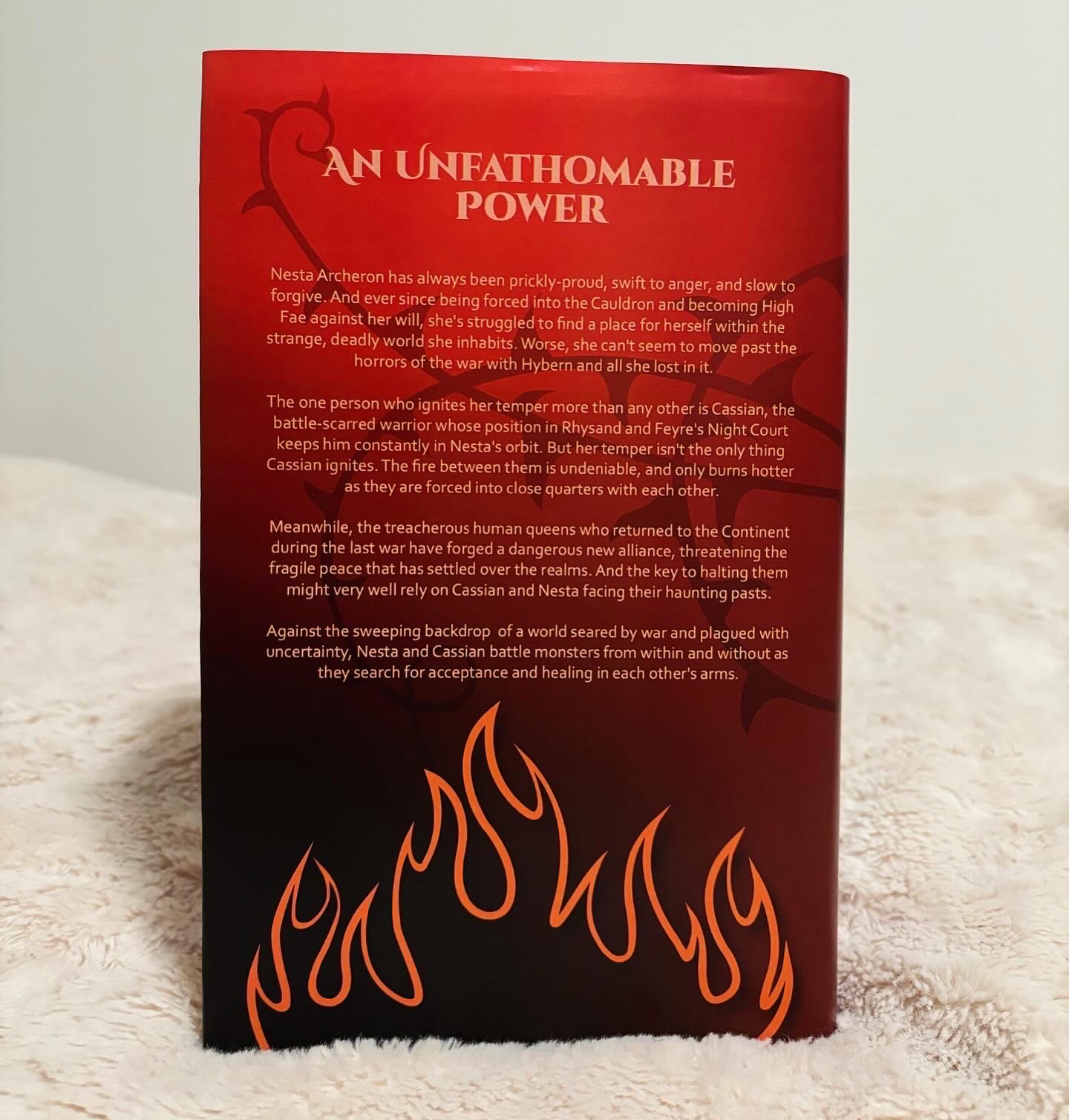
Deliverables: My final deliverables are all five books with redesigned dust jackets. Each book cover has a color that is associated with symbolism contained within that book. Red represents roses and trauma, purple represents the setting and a main character, pink represents friendship and love, blue represents winter and family, and orange represents adventure. Additionally, each book is illustrated on the back with an important symbol from the book. Although there are specific elements that are individual to each book, there are also elements that are consistent throughout them all. The typography stays consistent throughout the series and the main typography for the front cover has the same treatment with subtle changes throughout. Additionally, there are vines that weave throughout the background of all five books. This final result is a culmination a semester’s worth of hard work and critical design thinking, including multiple creative blocks and redirections. However, the end result is a product of all of that effort and has culminated into a product that represents the series in a new and accurate perspective.